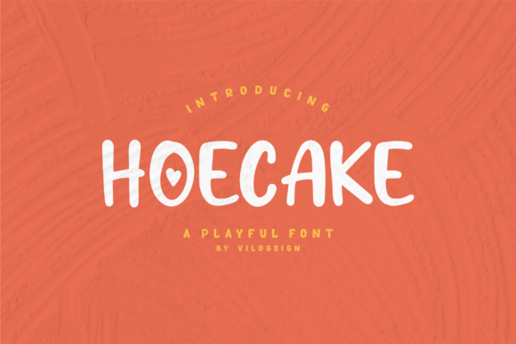
Hoecake: A Friendly Display Font for Digital Branding
As a web designer who builds landing pages, SaaS dashboards, and boutique e-commerce sites, I pay close attention to how typography shapes first impressions—and how quickly users decide whether a brand feels trustworthy, approachable, or memorable. That’s why Hoecake stands out in my font library: it’s a display font built for warmth, clarity, and digital intentionality—not just decoration.
Visually, Hoecake balances rounded openness with confident structure. Its letterforms have gentle curves, generous x-heights, and subtle personality—like a friendly nod rather than a shout. It’s not a script font or handwritten typeface, but it carries expressive charm without sacrificing legibility. That makes it ideal for digital contexts where tone matters as much as function: hero headlines, product launch banners, coaching website taglines, or the “About Us” section of a creative agency site.
In practice, Hoecake performs best where you need instant emotional resonance and strong visual hierarchy. On a landing page, pairing Hoecake for the main headline with a clean sans serif (like Inter or Manrope) for body copy creates rhythm and contrast—guiding the eye while keeping reading effortless. It’s especially effective above the fold: a short, bold phrase like “Your Ideas, Amplified” in Hoecake immediately signals optimism and human-centered design—qualities that support conversion-focused layouts without feeling salesy.
For online stores, Hoecake works well on category banners (“Handcrafted Goods”), limited-edition product labels (“Summer Drop”), or even subtle accents in navigation menus (e.g., “New Arrivals” in a lighter weight). It adds character without competing with product imagery—especially when used at larger sizes on light or neutral backgrounds. On dark mode interfaces, I recommend testing Hoecake at 48px+ with sufficient letter spacing; its open forms hold up well, though avoid using it below 24px for body-level text—it’s a display font, not a workhorse.
Readability on mobile is solid—but intentional. Hoecake shines in responsive hero sections when sized appropriately (min. 36px on mobile, 60px+ on desktop) and paired with adequate line height and contrast. Avoid tight tracking or stacking multiple lines of Hoecake in small containers—its strength lies in confident simplicity, not dense information delivery. For buttons or CTAs, use it sparingly: best reserved for primary action headers (“Start Your Free Trial”) rather than micro-interactions like “Add to Cart” labels, where functional clarity trumps stylistic flair.
Logo design and brand identity systems benefit significantly from Hoecake’s distinct voice. It conveys authenticity and approachability—ideal for wellness brands, creative studios, indie educators, or sustainable product lines. When used consistently across a website, email headers, and social media graphics, it reinforces a cohesive digital presence. Just ensure your logo usage aligns with the font’s licensing: Hoecake is a commercial font, so verify webfont embedding rights for live sites, client projects, and digital templates. Most reputable vendors include WOFF2 files optimized for fast loading and support common Latin-based languages—check for multilingual glyphs if your audience spans regions beyond English-speaking markets.
Font pairing is where Hoecake truly earns its place in professional workflows. Think of it as the “voice” and your body font as the “conversation.” Pair it with a neutral sans serif for modern, accessible interfaces—or go editorial with a warm serif (like Literata or Lora) for blogs or course platforms where storytelling and authority matter. Avoid pairing with other decorative fonts; Hoecake’s personality needs breathing room. In a portfolio site, for example, I’ve used Hoecake for project titles (“Brand Identity for Oak & Ember”) and swapped to a crisp geometric sans for case study text—creating clear separation between headline impact and detailed narrative.
It’s also worth checking what’s included in the Hoecake package before purchase. Does it offer stylistic alternates? Multiple weights? True italics (not algorithmically slanted)? These details affect flexibility across layouts—especially for dynamic content like blog headers or auto-generated product tags. If your CMS pulls headlines from structured data, having at least Regular and Bold ensures consistency without manual overrides.
For UI designers building app screens or dashboard welcome modals, Hoecake adds humanity without clutter. A brief onboarding message like “Welcome back—let’s create something great” gains sincerity when set in Hoecake, especially against a soft gradient or minimalist background. But remember: it’s not meant for interface labels, form fields, or tab navigation. Reserve it for moments where brand voice should lead—then step back and let your system font handle the rest.
Finally, consider context over coverage. Hoecake isn’t trying to be everything. It won’t replace your system font stack, nor should it. Its value is in strategic emphasis: reinforcing brand tone in high-impact zones, guiding user attention with warmth, and helping digital experiences feel intentionally human—not algorithmically polished. Whether you’re launching a new course, refreshing a Shopify store, or designing a one-page SaaS landing site, Hoecake gives you a reliable tool to say more with less—to communicate positivity, clarity, and care, all through thoughtful typography.
If you're evaluating display fonts for your next web project, ask yourself: does this typeface strengthen my brand’s voice *and* serve the user’s journey? With Hoecake, the answer is consistently yes—when used with purpose, paired with discipline, and embedded with technical care.